
Building UI in StereoKit
StereoKit uses an immediate mode UI system. Basically, you define the UI every single frame you want to see it! Sounds a little odd at first, but it does have some pretty tremendous advantages. Since very little state is actually stored, you can add, remove, and change your UI elements with trivial and standard code structures! You’ll find that you often have much less UI code, with far fewer places for things to go wrong.
The goal for this UI API is to get you up and running as fast as possible with a working UI! This does mean trading some design flexibility for API simplicity, but we also strive to retain configurability for those that need a little extra.
Making a Window
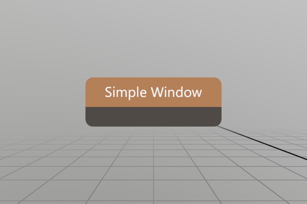
Lets start with a function that draws a simple, empty window.
void SimpleWindow(ref Pose windowPose)
{
	UI.WindowBegin("Simple Window", ref windowPose);

	UI.WindowEnd();
}
Looks pretty easy! You can begin a window, and end a window, and all
the UI elements between those two calls “belong” to that window. But
first, lets put this in context! StereoKit’s UI code must be called
every frame, so you would need to call SimpleWindow in your
application’s Step phase.
using StereoKit;

SK.Initialize();

Pose simpleWinPose = new (0, 0, -0.5f, Quat.LookDir(-Vec3.Forward));

SK.Run(()=> {
	SimpleWindow(ref simpleWinPose);
});
Note here that you own the Window’s Pose data, you can change it and
manage it however you want! StereoKit does take a reference to the
variable so it can update it based on the user’s current interaction
with the window, but that all happens immediately in the WindowBegin
function call, the reference doesn’t persist internally!
You might also have wondered about the Pose we used here! When the app starts up, the user will generally be at the “identity pose”, that is to say, at XYZ 0,0,0 facing forward 0,0,-1. For the window pose to be nice to a starting user, we put it half a meter forward, and have the window face backward towards the user’s starting point.
Making a Button
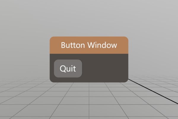
The simplest UI element, the button, illustrates nicely how “events”
occur in an immediate mode GUI system. Instead of some form of callback
or event, the Button function merely returns true on the first moment
it is pressed! You can safely put your function in an if statement,
and react to the interaction inline! Or pass execution along to a
callback, you do you.
void ButtonWindow(ref Pose windowPose)
{
	UI.WindowBegin("Button Window", ref windowPose);

	if (UI.Button("Quit"))
		SK.Quit();

	UI.WindowEnd();
}
Adding an image to a button is pretty easy too, UI.ButtonImg takes a
sprite and an optional layout to make your buttons a little snazzier!
Here we’re using one of StereoKit’s built-in default sprites, but you
can swap that out with a Sprite you’ve loaded from file too!
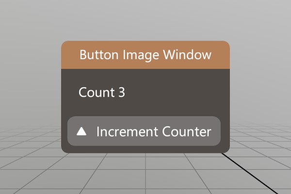
void ButtonImgWindow(ref Pose windowPose, ref int counter)
{
	UI.WindowBegin("Button Image Window", ref windowPose);

	UI.Label($"Count {counter}");
	if (UI.ButtonImg("Increment Counter", Sprite.ArrowUp))
		counter++;

	UI.WindowEnd();
}
Making a Toggle
Just to drive home the idea of how immediate mode state management
works, lets take a look at the Toggle element!
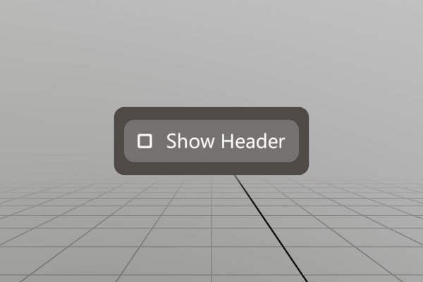
bool header = false;
void ToggleWindow(ref Pose windowPose)
{
	UI.WindowBegin("Toggle Window",
	               ref windowPose,
	               header ? UIWin.Normal : UIWin.Body);

	UI.Toggle("Show Header", ref header);

	UI.WindowEnd();
}
headeris used as a class global variable to illustrate the complete life of the variable. It could just as easily be arefparameter like thePose.
As you might expect, UI.Toggle is a UI element that will toggle a
boolean value whenever it’s pressed! Like the UI.Button, UI.Toggle
also has a return value, in this case it returns true anytime the
boolean value changes from interaction. Sometimes quite useful, but in
this case we don’t actually need an event to react to, we just use the
same boolean variable every frame when defining the window!
Though perhaps a subtle detail, this is one of the superpowers of an
immediate mode mentality. Recalculating the enum value every frame
allows us to avoid caching some separate UIWin variable in addition
to our header boolean. Our own header variable becomes a singular
source of truth that can be durable to mutation at any point in time.
Multiple sources of truth and cached values can often lead to
desynchronization bugs.
Custom Windows
StereoKit also supports the idea of objects as interfaces! Instead of putting UI elements onto windows, we can create 3D models and apply UI elements to their surface! StereoKit uses ‘handles’ to accomplish this, a grabbable area that behaves much like a window, but with a few more options for customizing layout and size.
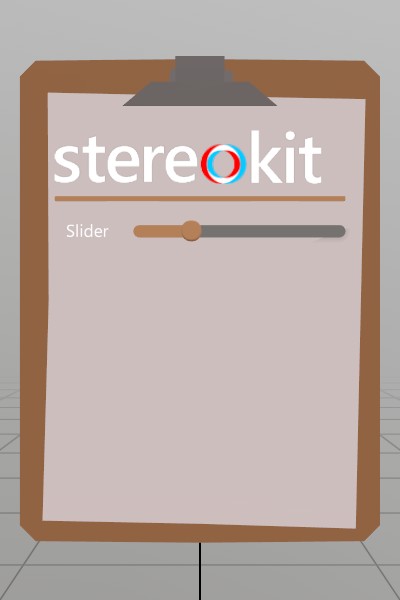
Model  clipboard  = Model .FromFile("Clipboard.glb");
Sprite logoSprite = Sprite.FromFile("StereoKitWide.png");
void CustomWindow(ref Pose windowPose, ref float slider)
{
	UI.HandleBegin("Clip", ref windowPose, clipboard.Bounds);
	// Handle also does not specify the valid layout area for the UI,
	// so we do this explicitly here. In this case, I know in advace
	// that the clipboard GLTF file has a usable surface that's about
	// 26x30cm.
	UI.LayoutArea(V.XY0(.13f, .15f), new Vec2(.26f, .3f));

	// Since the Handle does not draw anything, we must draw our own
	// visual! We can draw this at Identity because HandleBegin
	// pushes its pose onto the transform hierarchy. This is _not_ a
	// UI element, it's just a regular Model asset and does not use
	// any of the UI's layout tools.
	clipboard.Draw(Matrix.Identity);

	UI.Image(logoSprite, V.XY(.22f, 0));

	UI.HSeparator();

	UI.Label("Slider");
	UI.SameLine();
	UI.HSlider("slideId", ref slider, 0, 1);

	UI.HandleEnd();
}
As you can see, it looks basically like a Window with the Begin/End
pattern, but with the extra LayoutArea and custom visual. You can
find another more complex example of using GLTFs for UI with a radio
model over in the demos.
There’s also a few new UI elements here! A UI.Image to decorate the
interface a bit, a UI.HSeparator to visually separate or group
elements, a UI.Label to put a small bit of text on the UI (see
UI.Text for longer pieces of text!), UI.SameLine to manipulate the
layout and put the next UI element on the same ‘line’, and then
UI.HSlider, a nice tool for changing float values.
You can check out the Tearsheet Demo to see the vast majority of UI elements in use, or check the UI class docs for a complete list of UI related elements.
UI Layout
So far, our UI layout has been pretty simplistic! Each UI element has
for the most part determined its own size, and then advanced to the
next layout line for the next element. All StereoKit UI functions have
a number of variants to them, typically one that auto-layouts as much
as possible, one that accepts an explicit size, and one that completely
bypasses StereoKit’s layout system. The ones that bypass SK’s layout
system are named differently, UI.ButtonAt, UI.HSliderAt, etc.,
rather than just being overloads.
UI.___Atfunctions are useful when designing custom elements, element groups, or your own layout system, but are not often used at top level.
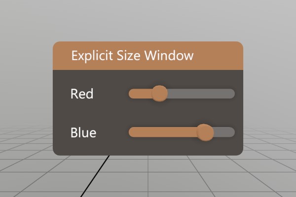
Here’s how explicitly sized UI elements work.
void ExplicitSizeWindow(ref Pose  windowPose,
                        ref float slider1,
                        ref float slider2)
{
	UI.WindowBegin("Explicit Size Window",
	               ref windowPose,
	               new Vec2(.2f, 0));

	// Explicit sizes on labels can be really useful for forcing the
	// text into visual columns, rather than ragged edges of auto
	// sized text.
	UI.Label("Red", new Vec2(.06f, 0));
	UI.SameLine();
	UI.HSlider("slideId1", ref slider1, 0, 1);

	UI.Label("Blue", new Vec2(.06f, 0));
	UI.SameLine();
	UI.HSlider("slideId2", ref slider2, 0, 1);

	UI.WindowEnd();
}
When a size of 0 is provided for either axis, StereoKit will auto-size that dimension. For a Window, it will grow in that direction. For UI elements, they will generally take all remaining space for the X axis, and use UI.LineHeight for the vertical axis.
You can also add extra space between elements, or reserve empty chunks of layout space. Reserving space is a common trick for when you need to draw something custom on the UI, but it can also be empty!
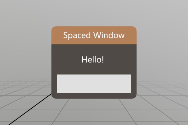
void SpaceWindow(ref Pose windowPose)
{
	UI.WindowBegin("Spaced Window", ref windowPose);

	// Add horizontal space in front of the label equal to the height
	// of one standard UI line.
	UI.HSpace(UI.LineHeight);
	UI.Label("Hello!");

	// Reserve a full UI line, and draw a cube there using non-UI
	// drawing functions.
	Bounds layout = UI.LayoutReserve(Vec2.Zero, false, 0.001f);
	Mesh.Cube.Draw(Material.Default,
	               Matrix.TS(layout.center, layout.dimensions));

	UI.WindowEnd();
}
Layout Cuts and Hierarchy
StereoKit also has a hierarchical layout area system, so you can always
push and pop Layout areas onto the Layout stack, and fill them with
elements. This can be arbitrary rectangles within the current Surface,
rectangles reserved on the current Layout via UI.LayoutReserve, or
areas “cut” from the current Layout with UI.LayoutPushCut.
See
UI.Push/PopSurfaceto create new UI Surfaces with different origins and orientations.UI.WindowBegin/Endinternally callsUI.Push/PopSurfacewith the Window’s Pose, but you can do the same at any point as well!
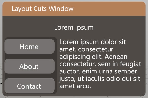
void LayoutCutsWindow(ref Pose windowPose)
{
	UI.WindowBegin("Layout Cuts Window",
	               ref windowPose,
	               new Vec2(0.3f, 0));

	UI.LayoutPushCut(UICut.Top, UI.LineHeight);
	// Center some text in this "Cut". We can do this by filling the
	// current layout by specifying a size of UI.LayoutRemaining, and
	// then setting the text to align to the center of its element
	// region.
	UI.Text("Lorem Ipsum",
	        TextAlign.Center,
	        TextFit  .None,
	        UI       .LayoutRemaining);
	UI.LayoutPop();

	UI.LayoutPushCut(UICut.Left, 0.1f);
	// We can use a non-layout "At" panel element to add a decorative
	// background to this entire layout area, without affecting the
	// layout of the elements in it.
	UI.PanelAt(UI.LayoutAt, UI.LayoutRemaining);
	// Explicit size these buttons to ensure they all take the same
	// width, instead of sizing to fit their text.
	UI.Button("Home",    V.XY(0.1f, 0));
	UI.Button("About",   V.XY(0.1f, 0));
	UI.Button("Contact", V.XY(0.1f, 0));
	UI.LayoutPop();

	// Fill the remaining uncut area with text.
	UI.Text("Lorem ipsum dolor sit amet, consectetur adipiscing "   +
	        "elit. Aenean consectetur, sem in feugiat auctor, enim "+
	        "urna semper justo, ut iaculis odio dui sit amet arcu.");

	UI.WindowEnd();
}
An Important Note About IDs
StereoKit does store a small amount of information about the UI’s state
behind the scenes, like which elements are active and for how long.
This internal data is attached to the UI elements via a combination of
their own ids, and the parent Window/Handle’s id!
This means you should be careful to NOT re-use ids within a
Window/Handle, otherwise you may find ghost interactions with
elements that share the same ids. If you need to have elements with the
same id, or if perhaps you don’t know in advance that all your
elements will certainly be unique, UI.PushId and UI.PopId can be
used to mitigate the issue by using the same hierarchy id mixing that
the Windows use to prevent collisions with the same ids in other
Windows/Handles.
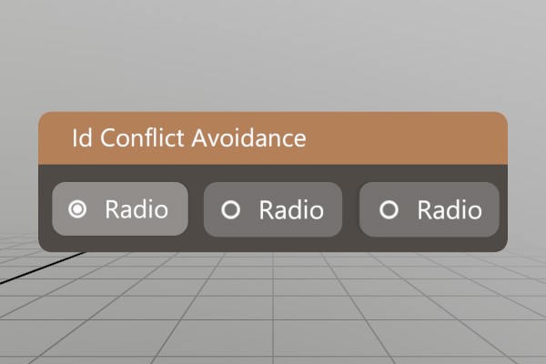
Here’s a set of Radio options, but all of them have the same name/id!
Pushing a unique id onto the id stack prevents the Radio ids from
conflicting!
void IdWindow(ref Pose windowPose, ref int option)
{
	UI.WindowBegin("Id Conflict Avoidance", ref windowPose);

	UI.PushId(1);
	if (UI.Radio("Radio", option == 1)) option = 1;
	UI.PopId();

	UI.SameLine();
	UI.PushId(2);
	if (UI.Radio("Radio", option == 2)) option = 2;
	UI.PopId();

	UI.SameLine();
	UI.PushId(3);
	if (UI.Radio("Radio", option == 3)) option = 3;
	UI.PopId();

	UI.WindowEnd();
}
What’s Next?
And there you go! That’s how UI works in StereoKit, pretty reasonable, huh? For further reference, and more UI methods, checkout the UI class documentation.
If you’d like to see the complete code for this sample, check it out on Github!
Found an issue with these docs, or have some additional questions? Create an Issue on Github!