
static class UI
This class is a collection of user interface and interaction methods! StereoKit uses an Immediate Mode GUI system, which can be very easy to work with and modify during runtime.
You must call the UI method every frame you wish it to be available, and if you no longer want it to be present, you simply stop calling it! The id of the element is used to track its state from frame to frame, so for elements with state, you’ll want to avoid changing the id during runtime! Ids are also scoped per-window, so different windows can re-use the same id, but a window cannot use the same id twice.
Static Fields and Properties
| Vec2 AreaRemaining | Use LayoutRemaining, removing in v0.4 |
| Color ColorScheme | StereoKit will generate a color palette from this gamma space color, and use it to skin the UI! To explicitly adjust individual theme colors, see UI.SetThemeColor. |
| bool Enabled | This returns the current state of the UI’s enabled status stack, set by UI.Push/PopEnabled. |
| bool EnableFarInteract | Enables or disables the far ray grab interaction for Handle elements like the Windows. It can be enabled and disabled for individual UI elements, and if this remains disabled at the start of the next frame, then the hand ray indicators will not be visible. This is enabled by default. |
| BtnState LastElementActive | Tells the Active state of the most recently called UI element that used an id. |
| BtnState LastElementFocused | Tells the Focused state of the most recently called UI element that used an id. |
| Vec3 LayoutAt | The hierarchy local position of the current UI layout position. The top left point of the next UI element will be start here! |
| Bounds LayoutLast | These are the layout bounds of the most recently reserved layout space. The Z axis dimensions are always 0. Only UI elements that affect the surface’s layout will report their bounds here. You can reserve your own layout space via UI.LayoutReserve, and that call will also report here. |
| Vec2 LayoutRemaining | How much space is available on the current layout! This is based on the current layout position, so X will give you the amount remaining on the current line, and Y will give you distance to the bottom of the layout, including the current line. These values will be 0 if you’re using 0 for the layout size on that axis. |
| float LineHeight | This is the height of a single line of text with padding in the UI’s layout system! |
| UISettings Settings | UI sizing and layout settings. |
| bool ShowVolumes | Shows or hides the collision volumes of the UI! This is for debug purposes, and can help identify visible and invisible collision issues. |
| UIMove SystemMoveType | This is the UIMove that is provided to UI windows that StereoKit itself manages, such as the fallback filepicker and soft keyboard. |
| TextStyle TextStyle | This returns the TextStyle that’s on top of the UI’s stack, according to UI.Push/PopTextStyle. |
Static Methods
| Button | A pressable button! A button will expand to fit the text provided to it, vertically and horizontally. Text is re-used as the id. Will return true only on the first frame it is pressed! |
| ButtonAt | A variant of UI.Button that doesn’t use the layout system, and instead goes exactly where you put it. |
| ButtonBehavior | This is the core functionality of StereoKit’s buttons, without any of the rendering parts! If you’re trying to create your own pressable UI elements, or do more extreme customization of the look and feel of UI elements, then this function will provide a lot of complex pressing functionality for you! |
| ButtonImg | A pressable button accompanied by an image! The button will expand to fit the text provided to it, horizontally. Text is re-used as the id. Will return true only on the first frame it is pressed! |
| ButtonImgAt | A variant of UI.ButtonImg that doesn’t use the layout system, and instead goes exactly where you put it. |
| ButtonRound | A pressable button! A button will expand to fit the text provided to it, vertically and horizontally. Text is re-used as the id. Will return true only on the first frame it is pressed! |
| ButtonRoundAt | A variant of UI.ButtonRound that doesn’t use the layout system, and instead goes exactly where you put it. |
| GenQuadrantMesh | This generates a quadrantified mesh meant for UI buttons by sweeping a lathe over the rounded corners of a rectangle! Note that this mesh is quadrantified, so it requires special shaders to draw properly! |
| GetThemeColor | This allows you to inspect the current normal color of the theme color category! If you set the color with UI.ColorScheme, this will be one of the generated colors, and not necessarily the color that was provided there. |
| GrabAuraEnabled | This retreives the top of the grab aura enablement stack, in case you need to know if the current window will have an aura. |
| Handle | This begins and ends a handle so you can just use its grabbable/moveable functionality! Behaves much like a window, except with a more flexible handle, and no header. You can draw the handle, but it will have no text on it. Returns true for every frame the user is grabbing the handle. |
| HandleBegin | This begins a new UI group with its own layout! Much like a window, except with a more flexible handle, and no header. You can draw the handle, but it will have no text on it. The pose value is always relative to the current hierarchy stack. This call will also push the pose transform onto the hierarchy stack, so any objects drawn up to the corresponding UI.HandleEnd() will get transformed by the handle pose. Returns true for every frame the user is grabbing the handle. |
| HandleEnd | Finishes a handle! Must be called after UI.HandleBegin() and all elements have been drawn. Pops the pose transform pushed by UI.HandleBegin() from the hierarchy stack. |
| HSeparator | This draws a line horizontally across the current layout. Makes a good separator between sections of UI! |
| HSlider | A horizontal slider element! You can stick your finger in it, and slide the value up and down. |
| HSliderAt | A variant of UI.HSlider that doesn’t use the layout system, and instead goes exactly where you put it. |
| HSpace | Adds some horizontal space to the current line! |
| Image | Adds an image to the UI! |
| Input | This is an input field where users can input text to the app! Selecting it will spawn a virtual keyboard, or act as the keyboard focus. Hitting escape or enter, or focusing another UI element will remove focus from this Input. |
| InteractVolume | This method will be removed in v0.4, use UI.VolumeAt. This watches a volume of space for pinch interaction events! If a hand is inside the space indicated by the bounds, this function will return that hand’s pinch state, as well as indicate which hand did it through the out parameter. Note that since this only provides the hand’s pinch state, it won’t give you JustActive and JustInactive notifications for when the hand enters or leaves the volume. |
| IsInteracting | Tells if the user is currently interacting with a UI element! This will be true if the hand has an active or focused UI element. |
| Label | Adds some text to the layout! Text uses the UI’s current font settings, which can be changed with UI.Push/PopTextStyle. Can contain newlines! |
| LastElementHandActive | Tells if the hand was involved in the active state of the most recently called UI element using an id. Active state is frequently a single frame in the case of Buttons, but could be many in the case of Sliders or Handles. |
| LastElementHandFocused | Tells if the hand was involved in the focus state of the most recently called UI element using an id. Focus occurs when the hand is in or near an element, in such a way that indicates the user may be about to interact with it. |
| LastElementHandUsed | Obsolete: Use LastElementHandActive, or LastElementHandFocused, removing in v0.4. |
| LayoutArea | Manually define what area is used for the UI layout. This is in the current Hierarchy’s coordinate space on the X/Y plane. |
| LayoutPop | This removes a layout from the layout stack that was previously added using LayoutPush, or LayoutPushCut. |
| LayoutPush | This pushes a layout rect onto the layout stack. All UI elements using the layout system will now exist inside this layout area! Note that some UI elements such as Windows will already be managing a layout of their own on the stack. |
| LayoutPushCut | This cuts off a portion of the current layout area, and pushes that new area onto the layout stack. Left and Top cuts will always work, but Right and Bottom cuts can only exist inside of a parent layout with an explicit size, auto-resizing prevents these cuts. All UI elements using the layout system will now exist inside this layout area! Note that some UI elements such as Windows will already be managing a layout of their own on the stack. |
| LayoutReserve | Reserves a box of space for an item in the current UI layout! If either size axis is zero, it will be auto-sized to fill the current surface horizontally, and fill a single LineHeight vertically. Returns the Hierarchy local bounds of the space that was reserved, with a Z axis dimension of 0. |
| Model | This adds a non-interactive Model to the UI panel layout. |
| NextLine | This will advance the layout to the next line. If there’s nothing on the current line, it’ll advance to the start of the next on. But this won’t have any affect on an empty line, try UI.Space for that. |
| PanelAt | If you wish to manually draw a Panel, this function will let you draw one wherever you want! |
| PanelBegin | This will begin a Panel element that will encompass all elements drawn between PanelBegin and PanelEnd. This is an entirely visual element, and is great for visually grouping elements together. Every Begin must have a matching End. |
| PanelEnd | This will finalize and draw a Panel element. |
| PopEnabled | Removes an ‘enabled’ state from the stack, and whatever was below will then be used as the primary enabled state. |
| PopGrabAura | This removes an enabled status for grab auras from the stack, returning it to the state before the previous PushGrabAura call. Grab auras are an extra space and visual element that goes around Window elements to make them easier to grab. |
| PopId | Removes the last root id from the stack, and moves up to the one before it! |
| PopPreserveKeyboard | This pops the keyboard presentation state to what it was previously. |
| PopSurface | This will return to the previous UI layout on the stack. This must be called after a PushSurface call. |
| PopTextStyle | Removes a TextStyle from the stack, and whatever was below will then be used as the GUI’s primary font. |
| PopTint | Removes a Tint from the stack, and whatever was below will then be used as the primary tint. |
| PopupPose | This creates a Pose that is friendly towards UI popup windows, or windows that are created due to some type of user interaction. The fallback file picker and soft keyboard both use this function to position themselves! |
| ProgressBar | This is a simple horizontal progress indicator bar. This is used by the HSlider to draw the slider bar beneath the interactive element. Does not include any text or label. |
| ProgressBarAt | This is a simple horizontal progress indicator bar. This is used by the HSlider to draw the slider bar beneath the interactive element. Does not include any text or label. |
| PushEnabled | All UI between PushEnabled and its matching PopEnabled will set the UI to an enabled or disabled state, allowing or preventing interaction with specific elements. The default state is true. |
| PushGrabAura | This pushes an enabled status for grab auras onto the stack. Grab auras are an extra space and visual element that goes around Window elements to make them easier to grab. MUST be matched by a PopGrabAura call. |
| PushId | Adds a root id to the stack for the following UI elements! This id is combined when hashing any following ids, to prevent id collisions in separate groups. |
| PushPreserveKeyboard | When a soft keyboard is visible, interacting with UI elements will cause the keyboard to close. This function allows you to change this behavior for certain UI elements, allowing the user to interact and still preserve the keyboard’s presence. Remember to Pop when you’re finished! |
| PushSurface | This will push a surface into SK’s UI layout system. The surface becomes part of the transform hierarchy, and SK creates a layout surface for UI content to be placed on and interacted with. Must be accompanied by a PopSurface call. |
| PushTextStyle | This pushes a Text Style onto the style stack! All text elements rendered by the GUI system will now use this styling. |
| PushTint | All UI between PushTint and its matching PopTint will be tinted with this color. This is implemented by multiplying this color with the current color of the UI element. The default is a White (1,1,1,1) identity tint. |
| QuadrantSizeMesh | This will reposition the Mesh’s vertices to work well with quadrant resizing shaders. The mesh should generally be centered around the origin, and face down the -Z axis. This will also overwrite any UV coordinates in the verts. You can read more about the technique here. |
| QuadrantSizeVerts | This will reposition the vertices to work well with quadrant resizing shaders. The mesh should generally be centered around the origin, and face down the -Z axis. This will also overwrite any UV coordinates in the verts. You can read more about the technique here. |
| Radio | A Radio is similar to a button, except you can specify if it looks pressed or not regardless of interaction. This can be useful for radio-like behavior! Check an enum for a value, and use that as the ‘active’ state, Then switch to that enum value if Radio returns true. |
| RadioAt | A Radio is similar to a button, except you can specify if it looks pressed or not regardless of interaction. This can be useful for radio-like behavior! Check an enum for a value, and use that as the ‘active’ state, Then switch to that enum value if Radio returns true. This version allows you to override the images used by the Radio. |
| ReserveBox | Use LayoutReserve, removing in v0.4 |
| SameLine | Moves the current layout position back to the end of the line that just finished, so it can continue on the same line as the last element! |
| SetElementColor | This allows you to override the color category that a UI element is assigned to. |
| SetElementSound | This sets the sound that a particulat UI element will make when you interact with it. One sound when the interaction starts, and one when it ends. |
| SetElementVisual | Override the visual assets attached to a particular UI element. Note that StereoKit’s default UI assets use a type of quadrant sizing that is implemented in the Material and the Mesh. You don’t need to use quadrant sizing for your own visuals, but if you wish to know more, you can read more about the technique here. You may also find UI.QuadrantSizeVerts and UI.QuadrantSizeMesh to be helpful. |
| SetThemeColor | This allows you to explicitly set a theme color, for finer grained control over the UI appearance. Each theme type is still used by many different UI elements. This will automatically generate colors for different UI element states. |
| Space | Adds some space! If we’re at the start of a new line, space is added vertically, otherwise, space is added horizontally. |
| StackHash | This will hash the given text based id into a hash for use with certain StereoKit UI functions. This includes the hash of the current id stack. |
| Text | Displays a large chunk of text on the current layout. This can include new lines and spaces, and will properly wrap once it fills the entire layout! Text uses the UI’s current font settings, which can be changed with UI.Push/PopTextStyle. |
| TextAt | Displays a large chunk of text on the current layout. This can include new lines and spaces, and will properly wrap once it fills the entire layout! Text uses the UI’s current font settings, which can be changed with UI.Push/PopTextStyle. |
| Toggle | A toggleable button! A button will expand to fit the text provided to it, vertically and horizontally. Text is re-used as the id. Will return true any time the toggle value changes, NOT the toggle value itself! |
| ToggleAt | A variant of UI.Toggle that doesn’t use the layout system, and instead goes exactly where you put it. |
| VolumeAt | This Method is obsolete and will be removed soon. Please use any other overload of this method. |
| VSlider | A vertical slider element! You can stick your finger in it, and slide the value up and down. |
| VSliderAt | A variant of UI.VSlider that doesn’t use the layout system, and instead goes exactly where you put it. |
| VSpace | Adds some vertical space to the current line! All UI following elements on this line will be offset. |
| WindowBegin | Begins a new window! This will push a pose onto the transform stack, and all UI elements will be relative to that new pose. The pose is actually the top-center of the window. Must be finished with a call to UI.WindowEnd(). |
| WindowEnd | Finishes a window! Must be called after UI.WindowBegin() and all elements have been drawn. |
Examples
A simple button
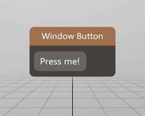
This is a complete window with a simple button on it! UI.Button
returns true only for the very first frame the button is pressed, so
using the if(UI.Button()) pattern works very well for executing
code on button press!
Pose windowPoseButton = new Pose(0, 0, 0, Quat.Identity);
void ShowWindowButton()
{
	UI.WindowBegin("Window Button", ref windowPoseButton);

	if (UI.Button("Press me!"))
		Log.Info("Button was pressed.");

	UI.WindowEnd();
}
Found an issue with these docs, or have some additional questions? Create an Issue on Github!